Graphical
Analysis (G.A.) Version 3.0
Part
I: Plot your walking lab data on GA. Plot distance vs. time.
Time goes in the x column, Distance goes in the y column:
Then, do the following:
·
Double Click on “x” and “y” at the top of the columns and change them to
(time) and (distance) respectively. Be
sure to also input their units.
·
Click
once on your graph to “highlight it”. Then,
click on the f(x) curve fit button at the top of the screen and do a
curve fit of your line (if you are doing the walking lab, this is most likely a
linear fit). Hit “Try Fit” and
if you like it, then click “OK”.
Hint: If you hold
your mouse over the buttons at the top of the screen for a second, it will tell
you what it does. What
is the slope of this line? ________________
·
How to title your graph: Double
click at the top of your graph and you will get a window which is entitled
“Graph Options”. Here you can
type the title of your graph.
·
How to make a calculated column: Go up
to DATA – New Calculated Column. For
the name, type: time^2.
Next, click on the arrow next to Variables (columns) and select
“time”. This is the column you
made earlier for the x axis.
Put ^2 after
“time” in the equations window so it looks like:
“time”^2
Notice that you also have other options located under a pull-down menu called “functions”. Take a look at these functions. You should see things like COS, SIN, Square root….etc. We’ll use those later
·
How to make a new graph: Highlight
the one graph you have on the screen now by clicking on it one time.
Then, shrink it by moving the arrow of your mouse to the lower right hand
corner of the graph and dragging it across the screen.
Go to INSERT – Graph
You can move your graphs or data around the field
by holding down on the
CTRL key (or the Apple key on a Mac)
and holding down your left mouse button
when you are over the graph or data table.
Try it, it’ll knock your socks off!
·
Click on
the x-axis of the new graph window
(between the two arrows) and select “time^2” from the pull-down arrow you
will see in the box titled “X axis options”.
·
Click on
the y-axis of the new graph window
and select the box for “distance”
Once
you have done all of these steps and have arranged your data table and both
graphs in a nice and neat fashion, call over your
teacher to inspect your work!
Part
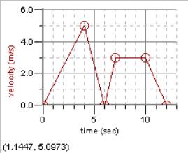
II: Finding the area under a curve
Put
the following data into the computer in a NEW file. No need to save the old one once I’ve seen it.
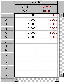
X Y
0
0
4
5
6
0
7
3
10
3
12
0
Title
x “time” with units of sec
Title y “velocity” with units of m/sec
·
Then,
click and drag the mouse across the entire graph from left to right.
·
Then, go
up to the button up top which when you point your mouse over it it will say
“integral”. Click on it!
·
Did you
get a little window with 28.5 in it? If
so, you did it right. If not, and
the whole thing didn’t change color, perhaps you didn’t select all of the
curve. You can drag your mouse over
more of it and you can see it all fill in right before your very eyes!
· Try this now on graph paper and see if you can see how the computer got 28.5
Call over your teacher to look at it when you are all done.
Put
the following data into a NEW file
0
90
180
270
360
Call over your teacher when you are finished with this task.
Type the following into the x column
X
1
2
3
4
5
6
Call over your teacher when you are finished with this task.